InTouch Systems
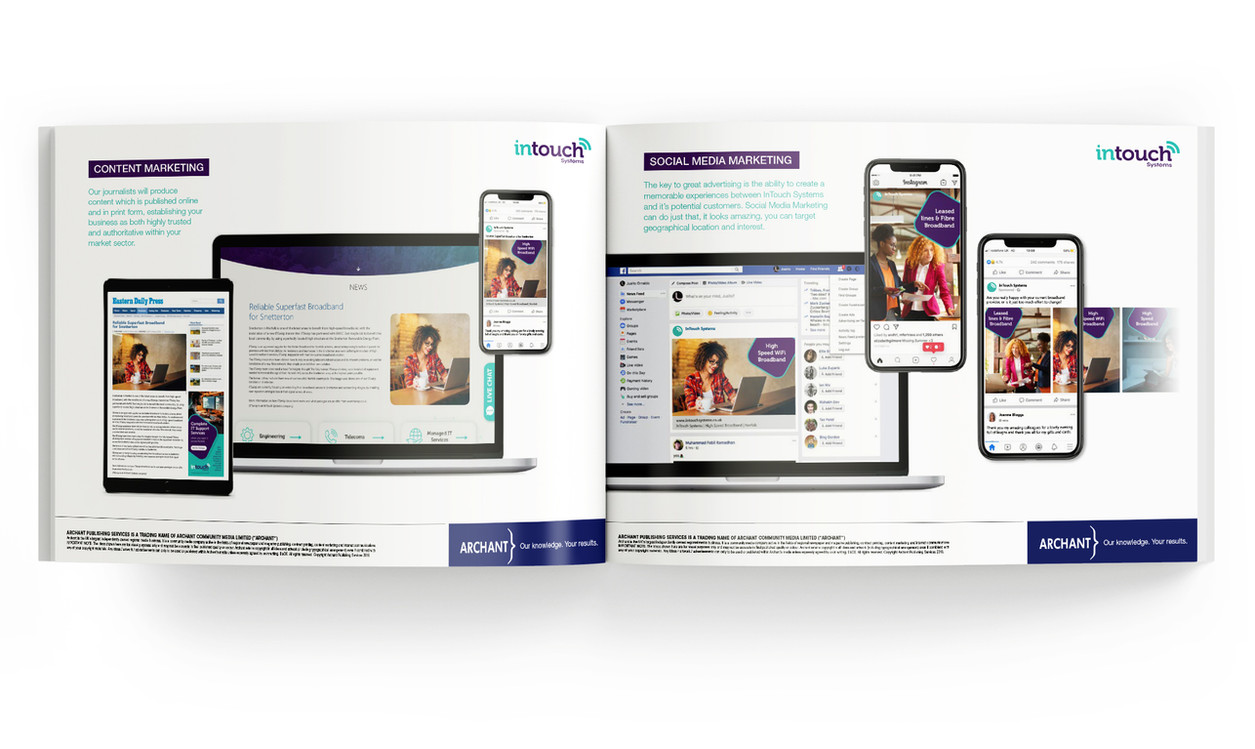
Intouch Systems asked us to create a new brand identity for their InTouch Systems, Itswisp, Wispire, ThinkingWisp and ItsFibre brands as part of a wider marketing strategy proposal.
I explored and developed the new logo [Illustrator] “InTouch”using Museo Slab typeface as the basis, while extending the serifs and reducing the character kerning to demonstrate the unification of the brands into one entity. The colour palette was carefully chosen to: Purple symbolises authority, trust and creativity that underpins their business, married with Teal that symbolises the strength, elegance and sophistication of their technological solutions.
The concept offered a flexible and extensive solution. As well as unifying the brand experience for their B2B clients, enabling a stronger penetration of the marketplace.
Formats: Billboard, Leaderboard, MPU, Mobile, HalfPage, social media posts, landing page, B2B and B2C email newsletters
Software: Adobe InDesign, Photoshop, Illustrator and Celtra (DCO)


